hi gofre&cofee
Graphic identity (corporate visual identity) of Coffee shop franquise
Graphic identity design
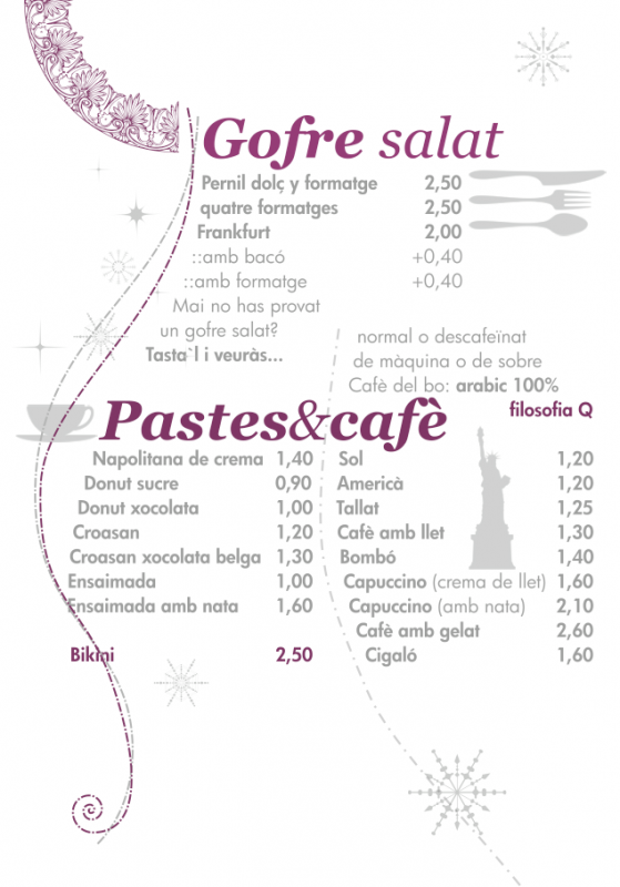
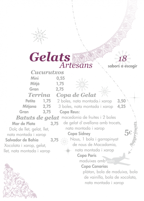
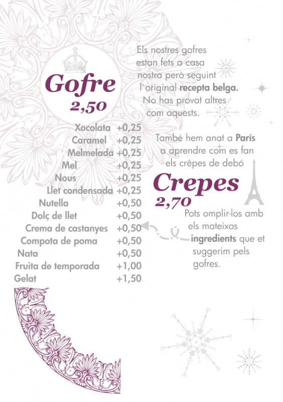
The graphic identity (corporate identity) of Hi, gofre & cofee applied to all communication of the franchise. The idea of travel wraps around the image design.
White is the color for this franchise. With details in soft magenta & grey.
Temporary exhibitions of pictures taken all over the world would use the walls of the Coffee Shop.
We took over the naming as well. Hi, as in the salutation, is a short word that anybody would use when arriving anywhere in the world. The first shop with this name was open in Reus (Catalonia). In Catalan language, “hi” is a grammatical complement with a meaning somehow related to place. Even if the customer doesn’t know the meaning of this word in English, knows it in Catalan.
Graphic identity work
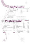
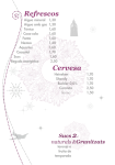
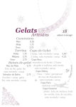
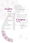
- Cartel business
- Refrigerators to the street cover.
- Charter Board
- Posters of Charter
- Napkin and napkin holder
- Cover to the bar.
- Stationery
- Web page
Corporate graphic identity plays a significant role in the way an organization presents itself to both internal and external stakeholders. In general terms, a corporate graphic identity expresses the values and ambitions of an organization, its business, and its characteristics. You may find a few functions of corporate visual identity.
- A corporate graphic identity provides an organisation with visibility and “recognizability”.
- A corporate graphic identity symbolizes an organization for external stakeholders, and, hence, contributes to its image and reputation.
- A corporate graphic identity expresses the structure of an organization to its external stakeholders, visualising its coherence as well as the relationships between divisions or units.
- Internal function of corporate graphic identity relates to employees’ identification with the organization as a whole and/or the specific departments they work for.







 We are a multidisciplinary Studio. We face our customer needs as a challenge and don't give up till a complete satisfaction is achieved.